Creating your first ever very own custom Android View!

When I first started out with Android, most of the work I did was with the predefined Views — TextView, EditText, etc. It took me a long while to decide that I needed to learn how to write custom views, and I think the reason I put it off is because a) it looked very very specialist whilst most of the work I did could be completed with the provided Views or an available library and b) I had absolutely no idea how profoundly simple it was.
So, join me as we create a very very simple custom view: A circle with XML-defined attributes that changes colour when you press it. Onward!
Create a new project in Android Studio
Call it “My First View”. For the sake of this demonstration, just create it with an empty Activity and whatever SDK you like (I’ve targeted API 19).
Create your View class
Create a new Java class called CircleView.java. In the create dialog, type android.view.View into the Superclass field. Otherwise, keep the other defaults and press OK.

You should now have your shiny new View class, but Android Studio will be complaining with its big zig-zaggy red underline. This is because your View needs a default constructor.
So let’s throw in some constructors…
public class CircleView extends View {
    public CircleView(Context context) {
        this(context, null);
    }

    public CircleView(Context context,
                      @Nullable AttributeSet attrs) {
        this(context, attrs, 0);
    }

    public CircleView(Context context,
                      @Nullable AttributeSet attrs,
                      int defStyleAttr) {
        super(context, attrs, defStyleAttr);
    }
}
And there you have it! Your very first custom View. Granted that it doesn’t do much that View doesn’t — or anything View doesn’t for that matter. So let’s do something with it. First of all, let’s put this View into your Layout XML (activity_main.xml if you followed all the defaults)…
For the sake of simplicity, let’s use a LinearLayout (it doesn’t really matter, you can keep it as ConstraintLayout if you want, we’re just not too worried about Layouts for this tutorial!).
<?xml version="1.0" encoding="utf-8"?>
<LinearLayout
    xmlns:android="http://schemas.android.com/apk/res/android"
    xmlns:tools="http://schemas.android.com/tools"
    android:layout_width="match_parent"
    android:layout_height="match_parent"
    tools:context=".MainActivity">

    <com.example.chrisward.myfirstview.CircleView
        android:layout_width="100dp"
        android:layout_height="100dp"
        android:background="#0000ff"
    />

</LinearLayout>
In the above example, com.example.chrisward should be replaced with whatever domain you created the project with, but if you start typing CircleView, Android Studio should offer you an autocomplete.
Here we’ve placed your View in the top left of the screen. We’ve made it 100 density-dependent pixels (dp) wide and 100dp high. So we can identify it, we’ve given it a blue background.
If you run the app, this is what you should see:
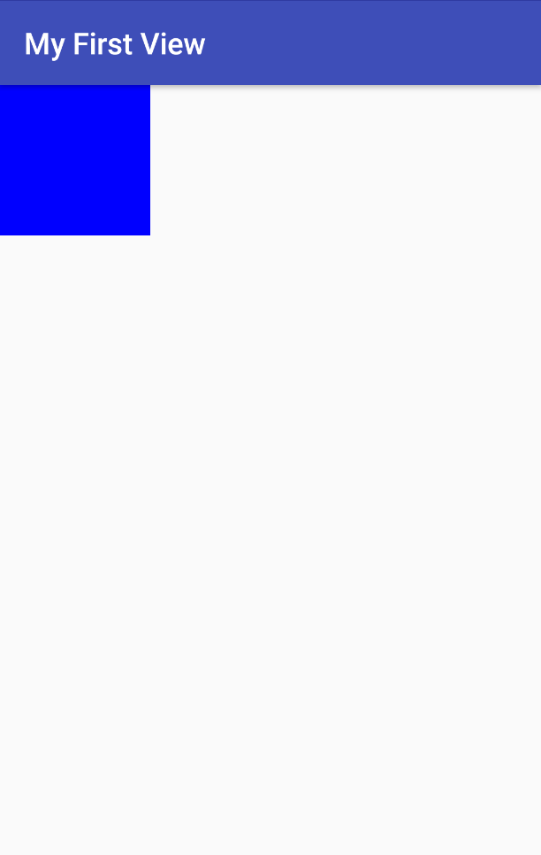
Congratulations! That’s your custom CircleView. Except it’s not a circle. And it doesn’t do much.
Let’s make it a circle
In your CircleView class, override the onDraw() method. This method does precisely what it says on the tin — it draws your View and this is where you do all the pretty stuff.
@Override
protected void onDraw(Canvas canvas) {
    super.onDraw(canvas);
    canvas.drawCircle(60, 60, 60, new Paint());
}
All we’ve done here is use the canvas object provided by the onDraw() method to call drawCircle(), which is provided for you out-of-the-box. The parameters for the method are:
- The x coordinate of the circle’s centre (60).
- The y coordinate of the circle’s centre (60).
- The radius of the circle (60).
- An instance of Paint. We’ll use this properly later.
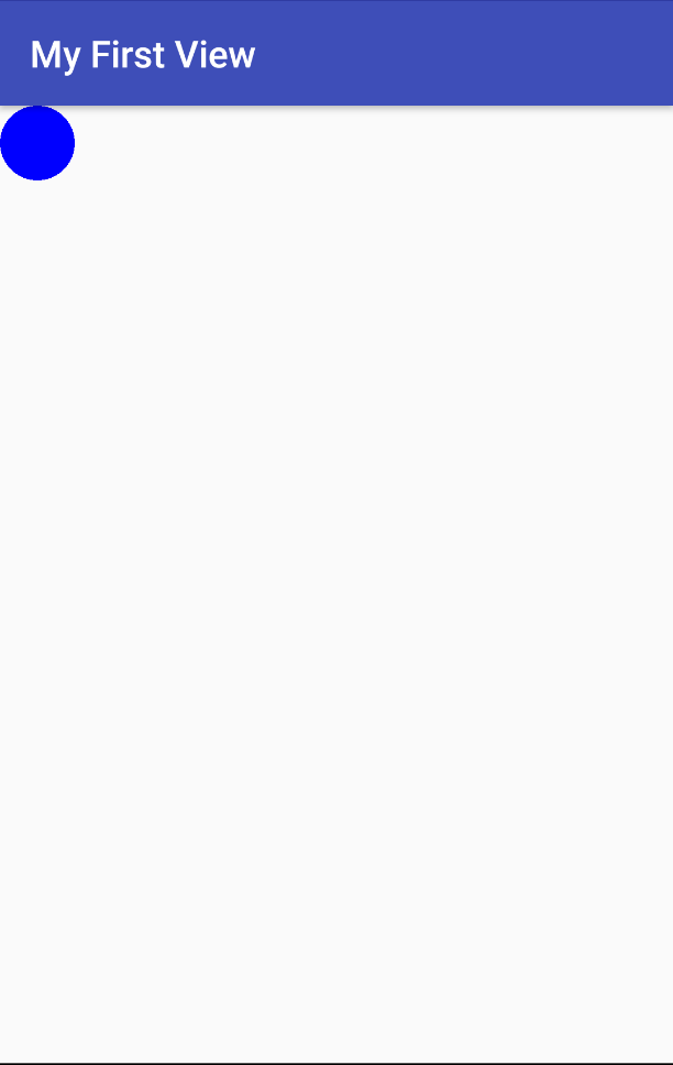
Now let’s run the app. You’ll see something like this:

So our own custom View finally does something View itself does not! But it doesn’t look particularly good. In the XML layout we specified a background of dark blue and that has been applied to the rectangle rather than the circle (which you’d expect).
Also, no matter how big we make the View, the circle inside will always have a radius of 60. Even without any user interaction, it’s not particularly useful for a developer because they have no way of customising it. Let’s change that.
Make the background colour apply to the circle, not the rectangular View
First of all, let’s create a class variable called circleColour. Let’s also move our Paint object from the drawCircle call and make it a class variable too.
private int circleColour;
private Paint paint = new Paint();
Our onDraw() method should now look like this:
@Override
protected void onDraw(Canvas canvas) {
    super.onDraw(canvas);
    canvas.drawCircle(60, 60, 60, paint);
}
In the constructor we will get the background attribute supplied by the user. Amend your constructor code to look like the below:
public CircleView(Context context, @Nullable AttributeSet attrs, int defStyleAttr) {
    super(context, attrs, defStyleAttr);
    TypedArray a = context.obtainStyledAttributes(
        attrs,
        new int[] { android.R.attr.background },
        defStyleAttr,
        0
    );
    circleColour = a.getColor(0, Color.BLUE);
    a.recycle();
}
Let’s explain what’s going on above. First, we call obtainStyledAttributes() to… well… obtain the styled attributes! In it, we pass the attrs object we already have from the constructor, along with an array of the attributes we are interested in (in this case, only the background), the defStyleAttr value we have from the method and 0 for the defStyleRes parameter (don’t worry too much about what this means right now).
Now we have our array of attributes we can get the background colour from it. As we only requested one attribute, we know that the first and only element of the array will contain the background colour. Therefore, we call getColour() on the array, specifying the index (0) and a default value if the user hasn’t provided anything (I’ve decided on blue. Blue is a nice colour).
All we have to do now is to use that colour when we draw the circle. We do this using our Paint object. Amend the onDraw() method so it looks like the below:
@Override
protected void onDraw(Canvas canvas) {
super.onDraw(canvas);
paint.setColor(circleColour);
setBackgroundColor(Color.TRANSPARENT);
canvas.drawCircle(60, 60, 60, paint);
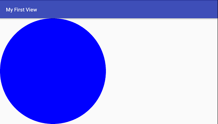
}If you run the app now, you’ll see that the black circle on a dark blue background is now a dark blue circle on a transparent background:
But what about the size?
We still have the problem that no matter what width and height the user specifies, our circle is always going to be the same size (radius of 60). We need to get the dimensions specified by the user and use those instead of just 60 every time. However, we only need one — the radius, whereas the user can specify both a width and a height.
Our circle can only be as big as the smallest dimension, so if the user specifies a width of 60 but a height of 90, our radius must be 60.
Let’s create a new class variable for our circle’s radius:
private float circleRadius;Next we are going to override the onMeasure() method in our CircleView class. This is a truly magical method that provides you with all you need to deal with spacing and dimensions in your View. It is called before onDraw().
@Override
protected void onMeasure(int widthMeasureSpec, int heightMeasureSpec) {
    super.onMeasure(widthMeasureSpec, heightMeasureSpec);
    int width = MeasureSpec.getSize(widthMeasureSpec);
    int height = MeasureSpec.getSize(heightMeasureSpec);
    if (width == 0 && height == 0) {
        circleRadius = 0;
    } else {
        circleRadius = (width > height ? height : width) / 2;
    }
}
Let’s explain what this is doing.
The method receives two encoded specifications for the width and the height. Calling the getSize() method of the MeasureSpec class gets us the pixel value, no matter what values the user provided for layout_width and layout_height (including non-numeric values like “match_parent”).
If the width and length are 0, then the circle’s radius will be 0. Otherwise, we want to check which is the smallest value, then divide that value by 2 to arrive at our radius.
Finally, let’s amend our onDraw() method so we remove the “60” values and replace it with our circleRadius variable:
@Override
protected void onDraw(Canvas canvas) {
    super.onDraw(canvas);
    paint.setColor(circleColour);
    setBackgroundColor(Color.TRANSPARENT);
    canvas.drawCircle(circleRadius, circleRadius, circleRadius, paint);
}
So, if you change your layout_width and layout_height values to “match_parent” and run the app, you’ll see that the circle fills the space.

And if you flip the device to landscape, the circle sizing responds accordingly. Magic!
Well that’s lovely. We have a circle that sizes itself correctly and we can change its colour, but it doesn’t actually do anything.
Yes yes I know! We’re getting there.
To handle user interactions, we will override onTouchEvent() and performClick(). “A click, you say?”. Yes, I do say. The reason for this is accessibility (some accessibility software will fire click events rather than press events) and *every* Android developer should be making sure their code is usable by as many people as possible. Code should not discriminate on disability and the onus is on us to ensure we cater for all.
So, our implementations…
@Override
public boolean onTouchEvent(MotionEvent event) {
    if (event.getAction() == MotionEvent.ACTION_UP) {
        performClick();
    }
    return true;
}

@Override
public boolean performClick() {
    return super.performClick();
}
Currently this doesn’t do very much. In fact, it does nothing. Let’s change that. Add a new class variable:
private boolean active = false;Now let’s amend performClick() to toggle this flag:
@Override
public boolean performClick() {
    active = !active;
    invalidate();
    return super.performClick();
}
So, the first line of the method is simple — set the value to the opposite of what it currently is. But what about the second line? invalidate() tells the View that the current presentation is no longer valid and that it needs to be redrawn. In other words, the user has clicked the circle and set “active” to true. We want to change the colour of the View to reflect that and invalidate() is the mechanism by which we do that.
It also means we need to update the onDraw() method to check what state the View is in before deciding which colour the circle should be:
@Override
protected void onDraw(Canvas canvas) {
    super.onDraw(canvas);
    paint.setColor(active ? Color.RED : circleColour);
    setBackgroundColor(Color.TRANSPARENT);
    canvas.drawCircle(circleRadius, circleRadius, circleRadius, paint);
}
Here we check to see if the toggle is true. If so, we make the colour of the circle red. If not, we make the colour of the circle whatever the user specified as the background.
Now run the app, you’ll see that when you press the circle, it toggles between red and whichever colour the user has specified.
But what if the user picks red for a background?
We’ve, rather rudely, assumed the developer wants red for their active circle background. What if they want green, or purple, or hot pink?
In an ideal world, our Views would be as flexible as reasonably possible. This means that the active colour should be specified as an attribute, not hard-coded. Previously, we used the standard android View “background” property to decide what to colour the circle with. Now we have something that very specifically responds to a click, so we should probably create our own custom (and descriptive!) attribute. Whilst we’re at it, we should probably create our own custom attribute for the inactive background too.
In your res/values directory, create a file called attrs.xml. Paste the following code inside that file:
<?xml version="1.0" encoding="utf-8"?>
<resources>
    <declare-styleable name="CircleView">
        <attr name="inactive_background" format="color" />
        <attr name="active_background" format="color" />
    </declare-styleable>
</resources>
In this file, you declare a “styleable” for the View, giving it the name of the View (it doesn’t have to be the name of the view, it can be whatever you want it to be, but for consistency and readability, make it the name of the View). You then create your attribute with the <attr /> tag, which we’ve called “active_background” and we’ve specified that this attribute is a color one (rather than an integer, dimension, etc etc).
Let’s now edit our layout file. We need to do two things — replace the attributes on the CircleView tag, but also add in an XML namespace declaration:
xmlns:circle="http://schemas.android.com/apk/res-auto"And let’s amend our CircleTag to include the new attributes:
<com.example.chrisward.myfirstview.CircleView
    android:layout_width="match_parent"
    android:layout_height="match_parent"
    android:background="#0000ff"
    circle:inactive_background="#0000ff"
    circle:active_background="#ff0000"
/>
Back in our CircleView class, let’s add another class variable to store the active colour provided by the user:
private int activeColour;Now let’s amend the constructor to get these two properties properly.
public CircleView(Context context, @Nullable AttributeSet attrs, int defStyleAttr) {
    super(context, attrs, defStyleAttr);

    TypedArray a = context.obtainStyledAttributes(
            attrs,
            R.styleable.CircleView,
            defStyleAttr,
            0
    );
    circleColour = a.getColor(R.styleable.CircleView_inactive_background, Color.GRAY);
    activeColour = a.getColor(R.styleable.CircleView_active_background, Color.GRAY);
    a.recycle();
}
Notice how we now reference the attributes directly rather than using an index value.
If you run the app now, you’ll see that it works, with the colours corresponding to the values given in the XML layout file.
There is obviously a lot more than this to a View; but these are the basic building blocks. You will want to add methods to programatically change some of the properties (e.g. setInactiveCircleColour()) and for the press action to be meaningful you will want to give calling code a means of knowing when the circle has been pressed, e.g. accept listeners to be invoked from performClick(). And so on…
So there you have it. You’ve essentially just recreated a checkbox. Well, if a checkbox was actually a circle. And instead of being ticked it changed colour.
[You can find the full source code for this tutorial here on GitHub]


